Modern Moody Paint Colors We Love
- Mar 17
- 3 min read
Updated: Mar 18
Have you ever walked into a room that instantly felt both cozy and dramatic? That’s the power of a moody wall. At Doreen Corrigan Design, we’re captivated by interiors that feel layered, inviting, and wonderfully dramatic. These moody hues turn walls into a statement, infusing spaces with intimacy, drama, and timeless sophistication
Why Moody Colors Work
Contrary to popular belief, deep tones can make a room feel cozier and more expansive when paired with strategic lighting and layered textures. Dark colors add dimension, drawing the eye to architectural details, artwork, and curated décor that might otherwise fade into the background.
Add Depth: Moody walls bring textures, furniture, and finishes to life, giving the space a layered, luxurious feel that feels both intentional and inviting.
Enhance Contrast: Combining dark walls with lighter furnishings, metallic accents, or pops of color creates visual drama that keeps a room from feeling heavy or flat.
Set the Mood: Rich hues naturally create warmth and intimacy, making them ideal for bedrooms, dining rooms, libraries, or any space where comfort and connection are key.
When designed thoughtfully, moody interiors don’t just decorate a room—they transform it. They tell a story of elegance and personality while offering a canvas for the homeowner’s unique style.
Primary Bathroom Metropolis (Satin Finish)

Picking the Perfect Shade
Choosing the right dark color is about far more than picking “black” or “green.” The undertones of a paint, the way light falls across the walls, and the existing finishes in the room all influence the final effect.
Warm undertones: Shades like deep chocolate, burgundy, or rust bring cozy richness to a space, evoking a sense of warmth and sophistication.
Cool undertones: Charcoal, navy, and forest green create a calming, modern vibe, perfect for spaces where relaxation or focus is desired.
Room orientation: North-facing rooms often benefit from warmer shades to counterbalance cooler natural light, while sunlit rooms can handle saturated, bold hues that embrace brightness without overwhelming the space.
Selecting the perfect moody shade is a mix of science and artistry, balancing undertones, lighting, and furniture while keeping the homeowner’s personal style front and center.

Styling Around Moody Walls
Moody walls create the perfect backdrop for layering textures, materials, and accents:
Metals: Gold, brass, or copper elevate the space.
Textiles: Velvet, wool, and linen bring softness and richness.
Natural elements: Wood, stone, or greenery anchor the palette.
Statement lighting: Illuminates the rich color while enhancing the room’s atmosphere.

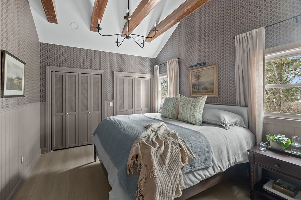
Primary Bedroom Timeless Taupe (Satin Finish)

Top 5 Moody Paint Colors We Love
Metropolis: A moody gray with subtle warmth, perfect for contemporary spaces.
Chelsea Mauve: A muted jewel tone that adds drama without overpowering a room.
Timeless Taupe: A classic neutral with depth, adaptable to a wide range of palettes.
Evergreen Fog: Deep green with gray undertones, ideal for cozy, intimate rooms.
Willowleaf: Earthy and luxurious, a shade that feels rooted in nature while remaining sophisticated.
Cozy Cottage Walls are Trim is Succulent (Satin Finish) Shiplap Walls (Flat) Evergreen Fog at 125%

Kitchen Walls are Rhinestone (Satin Finish)

The Doreen Corrigan Design Approach
Embracing dark interiors can feel intimidating, but when thoughtfully designed, they create rooms that are dramatic, welcoming, and timeless. At Doreen Corrigan Design, we help clients select colors and design elements that transform a home into a modern, moody sanctuary that's perfectly tailored to their style and space.
Bedroom Color Chelsea Mauve (Satin Finish)

Ready to go bold?
Let us help you curate a moody palette and design a home you’ll never want to leave. Whether you’re drawn to jewel-toned walls, rich earthy shades, or deep, enveloping neutrals, a moody interior can transform everyday living into a luxurious, personalized experience.


